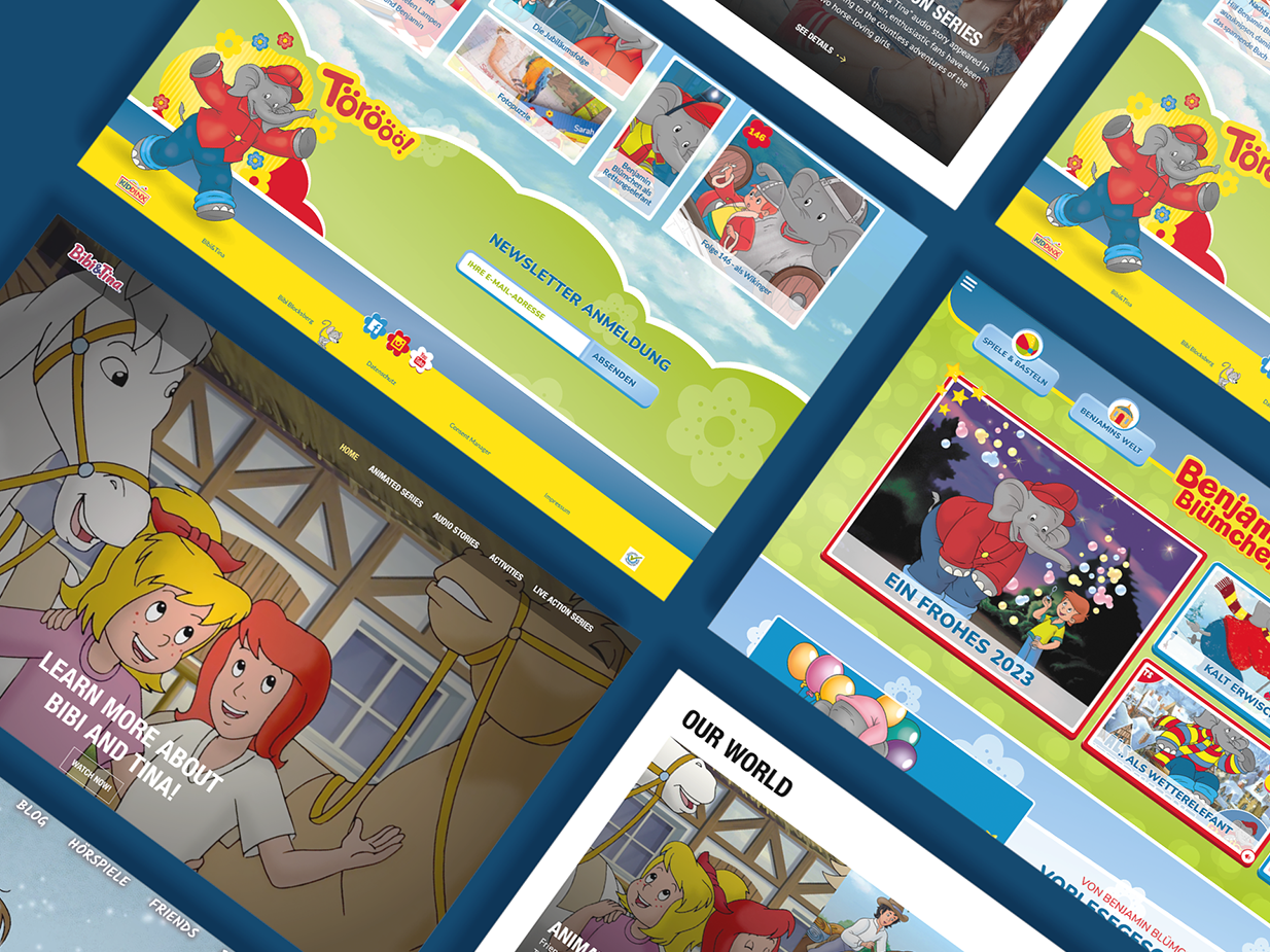
This project involves the implementation of a SaaS web frontend for an administrative software used to manage charging stations for electric mobility. The web-based interface will allow for easy and convenient access to the software's features, enabling efficient control of charging stations for electric vehicles.
The frontend has been built using a white label design system, which means it can be easily customized to match the branding of any company. This provides flexibility for businesses looking to integrate the frontend into their existing systems and ensures a seamless user experience for their customers.
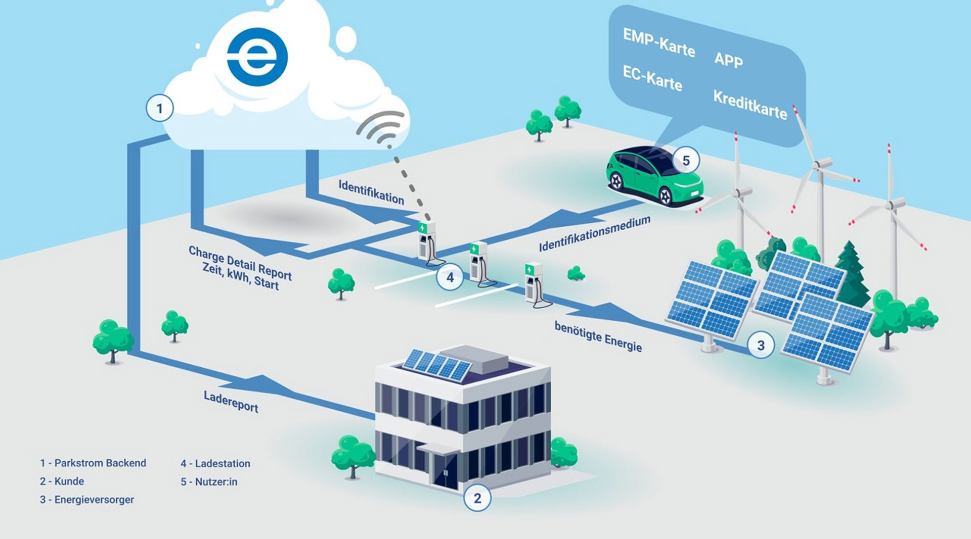
Informationen Flow explained / one use case
Personas
Meet Sarah, a charge point operator (CPO)!
As a CPO, Sarah's company owns and operates electric vehicle (EV) charging stations. Sarah and her team work hard to maintain the physical infrastructure needed to keep EV drivers on the road and offer a variety of services to make the charging experience as easy and convenient as possible for their customers.
This includes payment processing and customer support to help drivers troubleshoot any issues they may encounter while using the charging station.
Sarah is passionate about the role that CPOs play in the deployment and operation of charging infrastructure. She works closely with EV manufacturers, utilities, and government agencies to ensure that charging stations are located in convenient locations for drivers and that they provide the fastest and most reliable charging speeds possible.
"Through her work as a charge point operator, Sarah is helping to build a cleaner and more sustainable future for all of us."
Initial Situation
When I joined the project as a UX Designer, the company had already developed a software and frontend. However, the existing design was not user-friendly, and it required optimization. My task was to redesign the Front-end to improve its usability and add new functionalities to enhance the user experience. Working closely with the product owners, I collected feedback from the individuals who had used the software at every step. By incorporating their input, we were able to create a more intuitive and efficient software solution that better met the needs of the users.
Our Goal
Enhance the system's graphical user interface to promote a tidy and intuitive user experience. Incorporate new and advanced functionalities to broaden the system's capabilities. Ensure scalability to accommodate potential future developments. Facilitate seamless integration with diverse infrastructures. Streamline the process of branding for external companies.
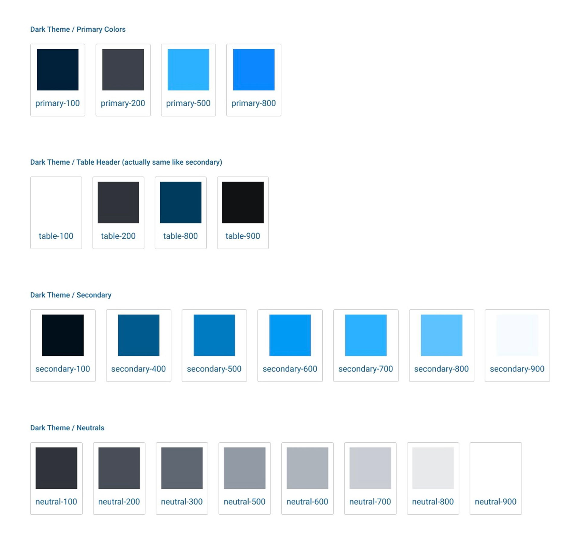
Parkstrom Design System
Global Design Tokens
🖼️ Borders
🎨 Colors
✨ Effects
📏 Spacing
🔤 Typography
Components
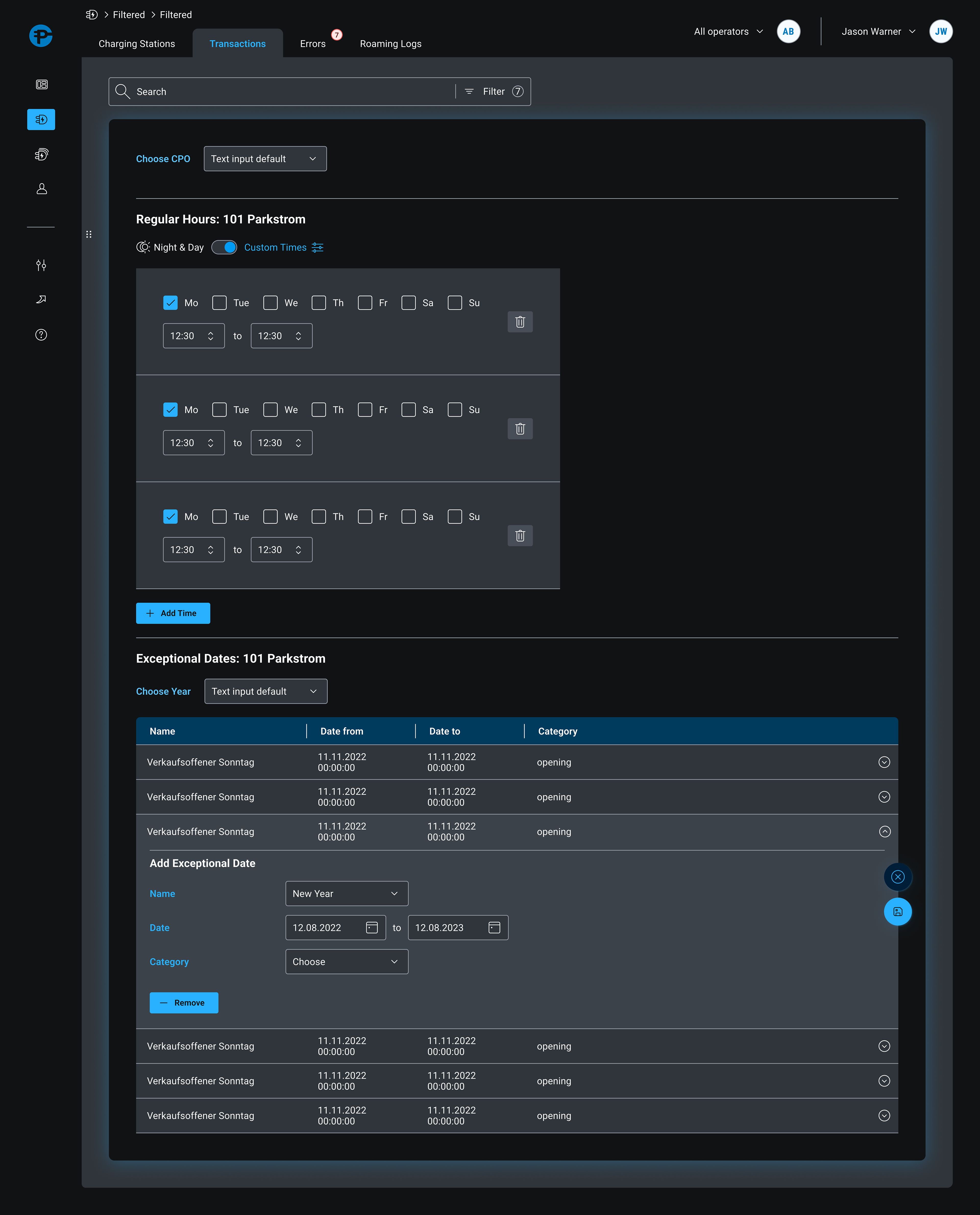
Buttons, Breadcrumbs, Checkbox, Chips, Dropdown, Headlines, Navigation, Map, Modal, Off Canvas, Form Elements, Tabs, Table Elements, Tooltipp …
Results
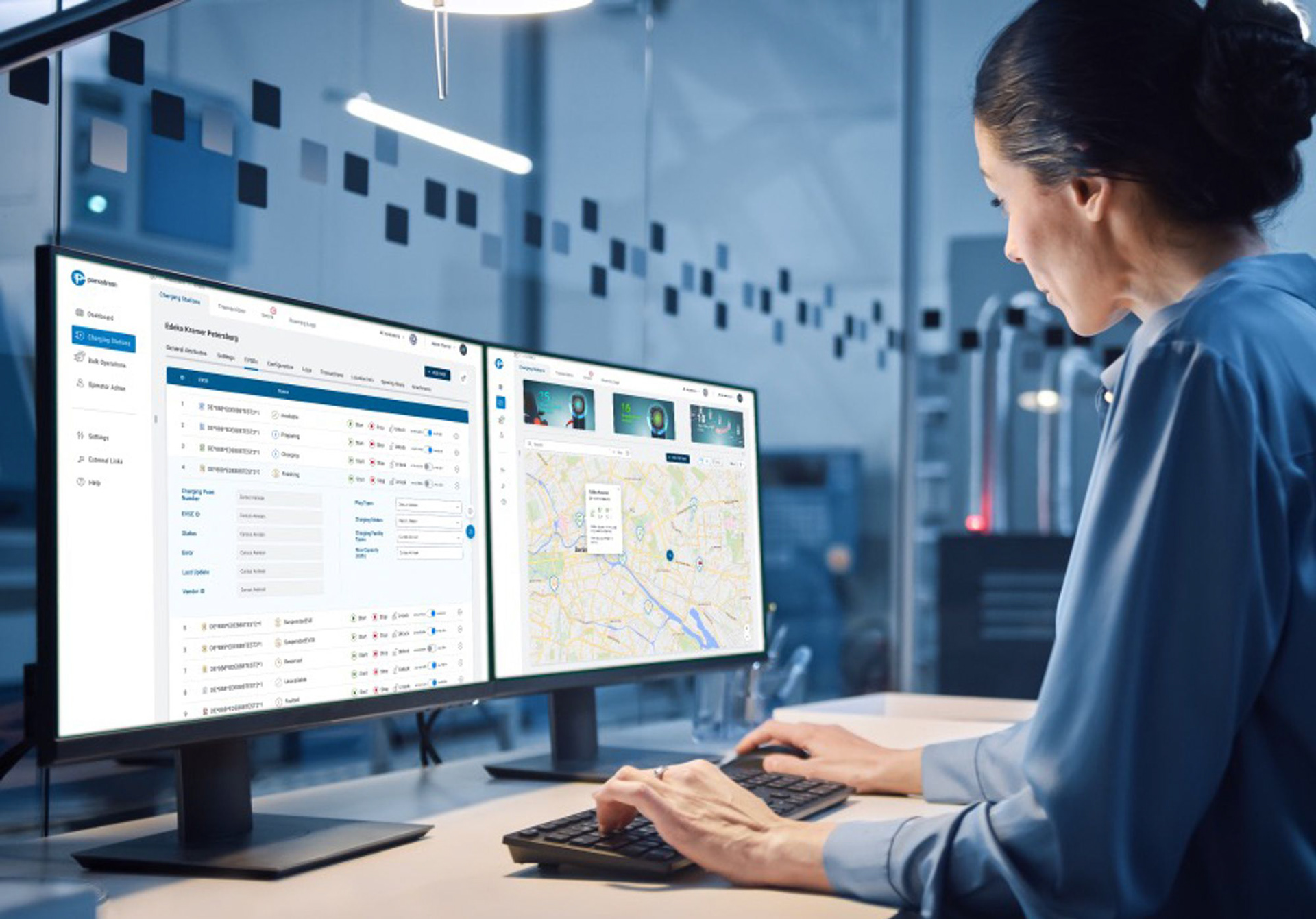
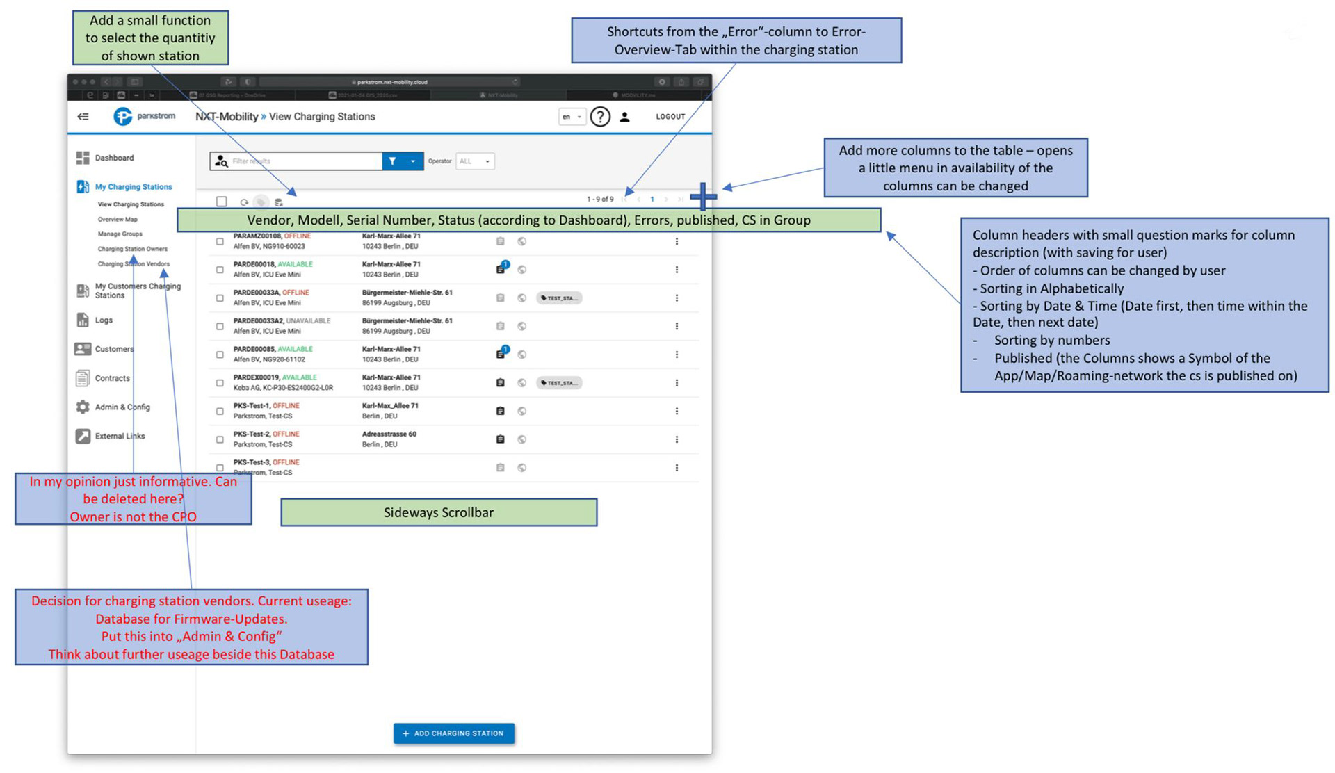
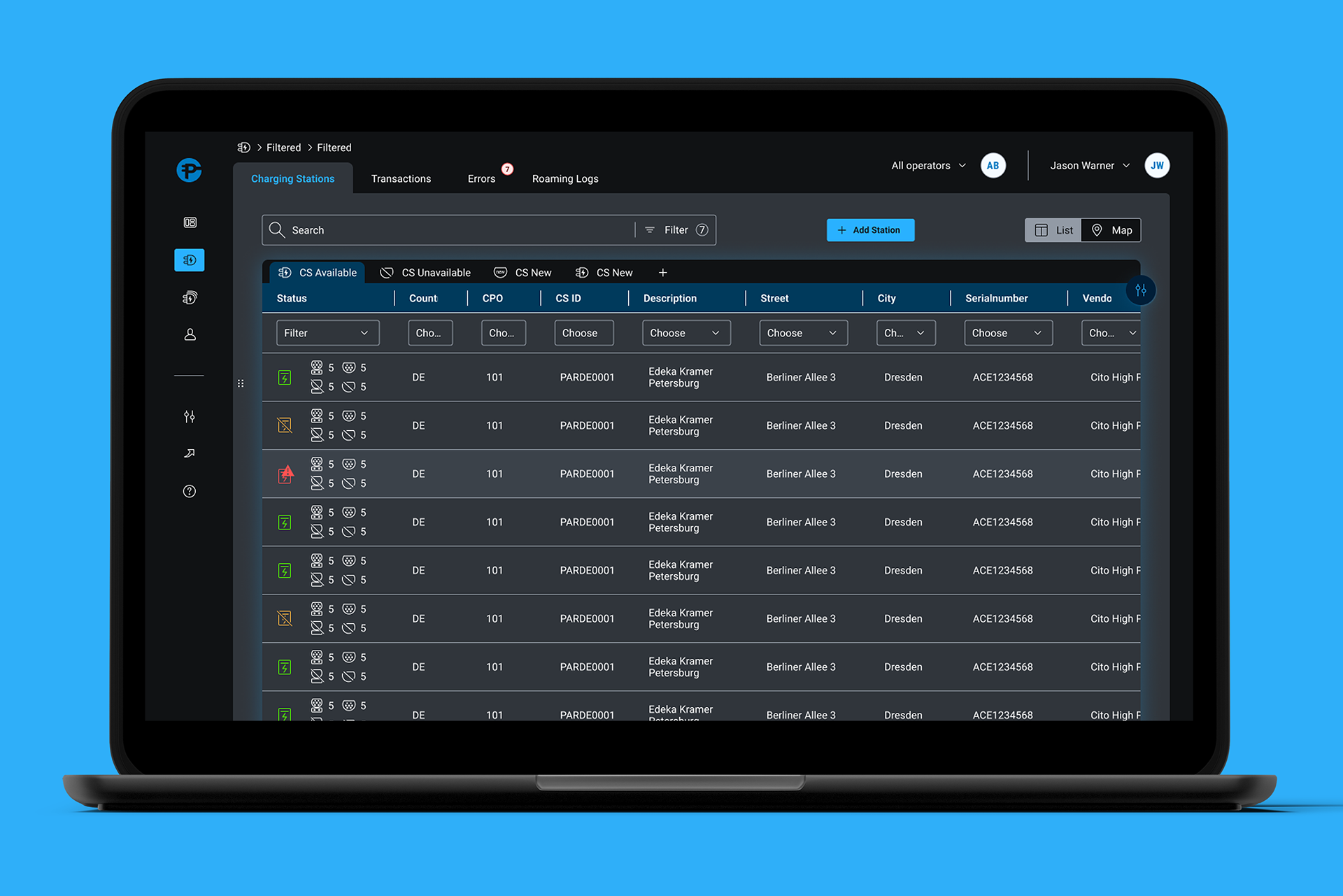
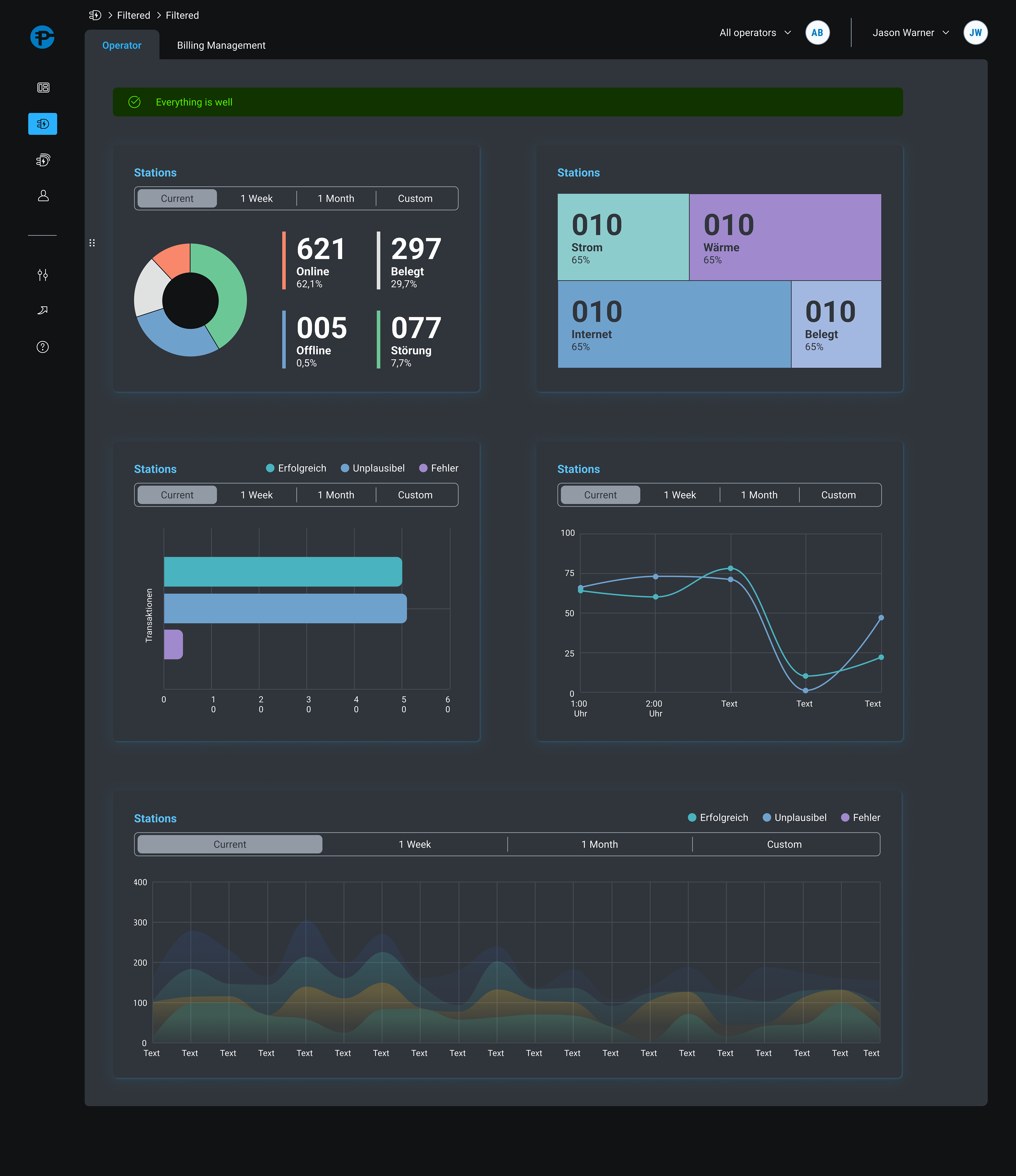
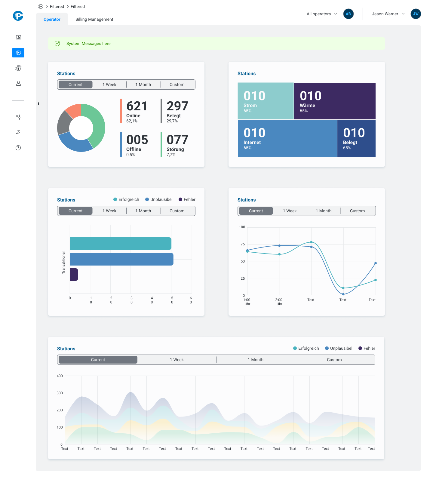
This is the primary page from which all CPOs commence their tasks. They can swiftly monitor all units and determine the operational and error-prone ones at a glance. With the aid of advanced filters, they can tailor the table to their preferences with ease. During the development process, we experimented with several alternatives, including dashboards and cards. However, our evaluations ultimately revealed that a straightforward table provides the optimal solution.
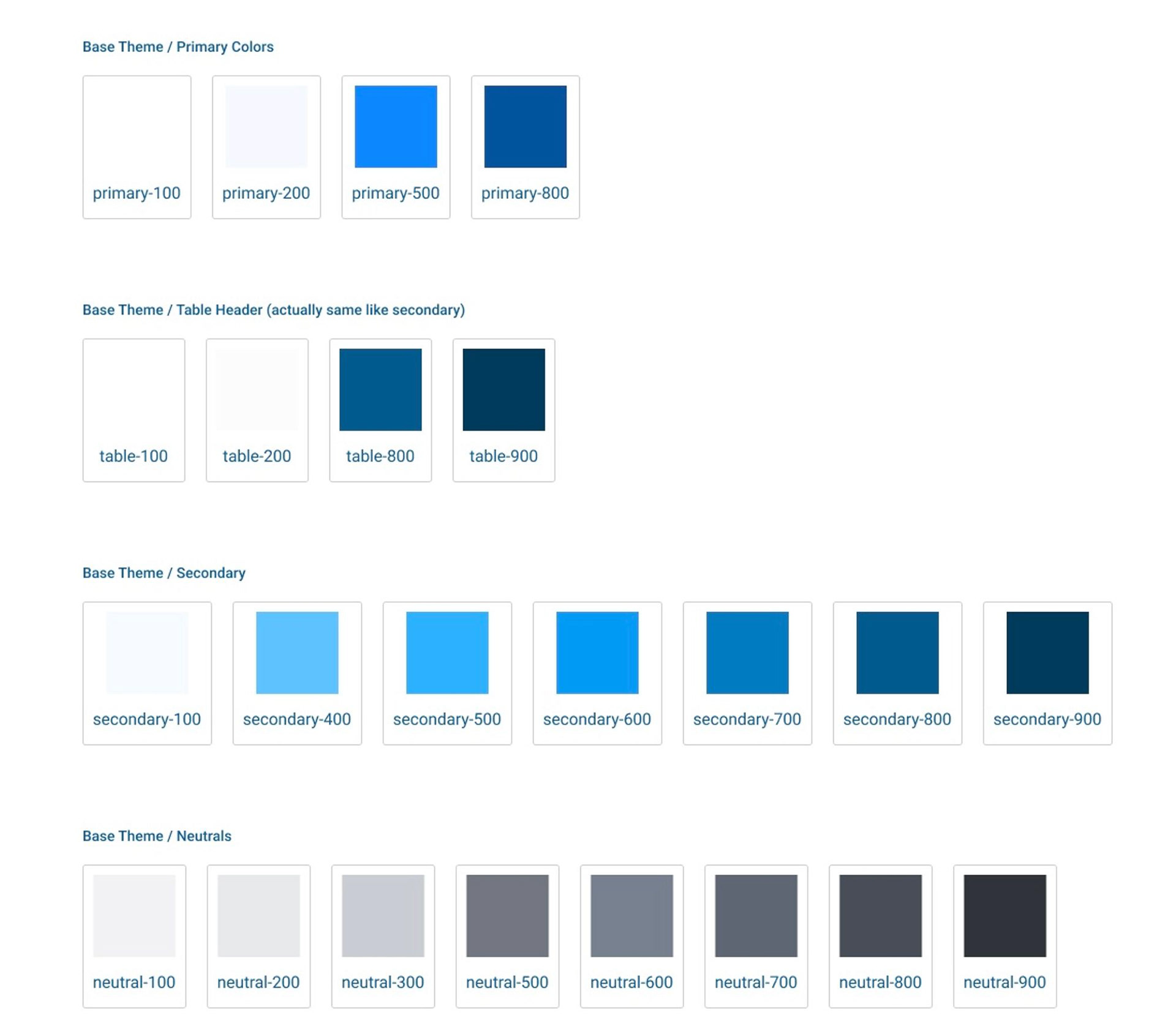
White Label Solution
Due to the intricacy of the application, we have opted to limit the number of modifications that can be made in order to mitigate the risk of compromising the layout's functionality and rendering it inoperable. Consequently, we have established a separate theme layer, enabling companies to incorporate their distinct brand colors and typography.
Brand specific Tokens
Dark Theme and examples
Base Theme and examples
Insights
Initially, the implementation of visually captivating filters was primarily motivated by marketing objectives. However, upon assessment, their practical value was found to be inadequate, while their size occupied excessive space.
In an attempt to address this issue, a smaller version was tested to allow for a greater number of items. Despite this adjustment, the outcome remained unsatisfactory.
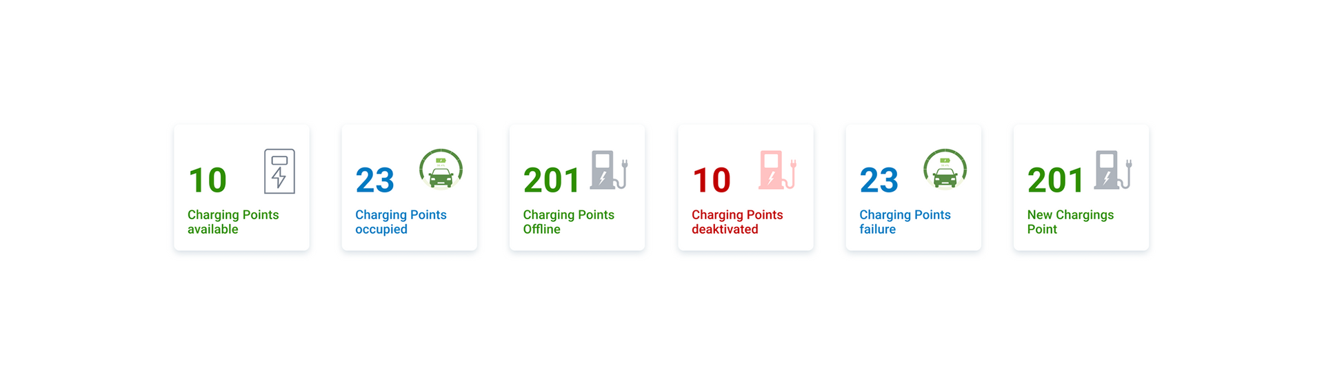
After several iterations, a tab-based solution was developed, strategically positioned on the table. As a result, the UI achieved a more refined appearance, following the UX Law of Proximity, and offering ample space for customized filters.
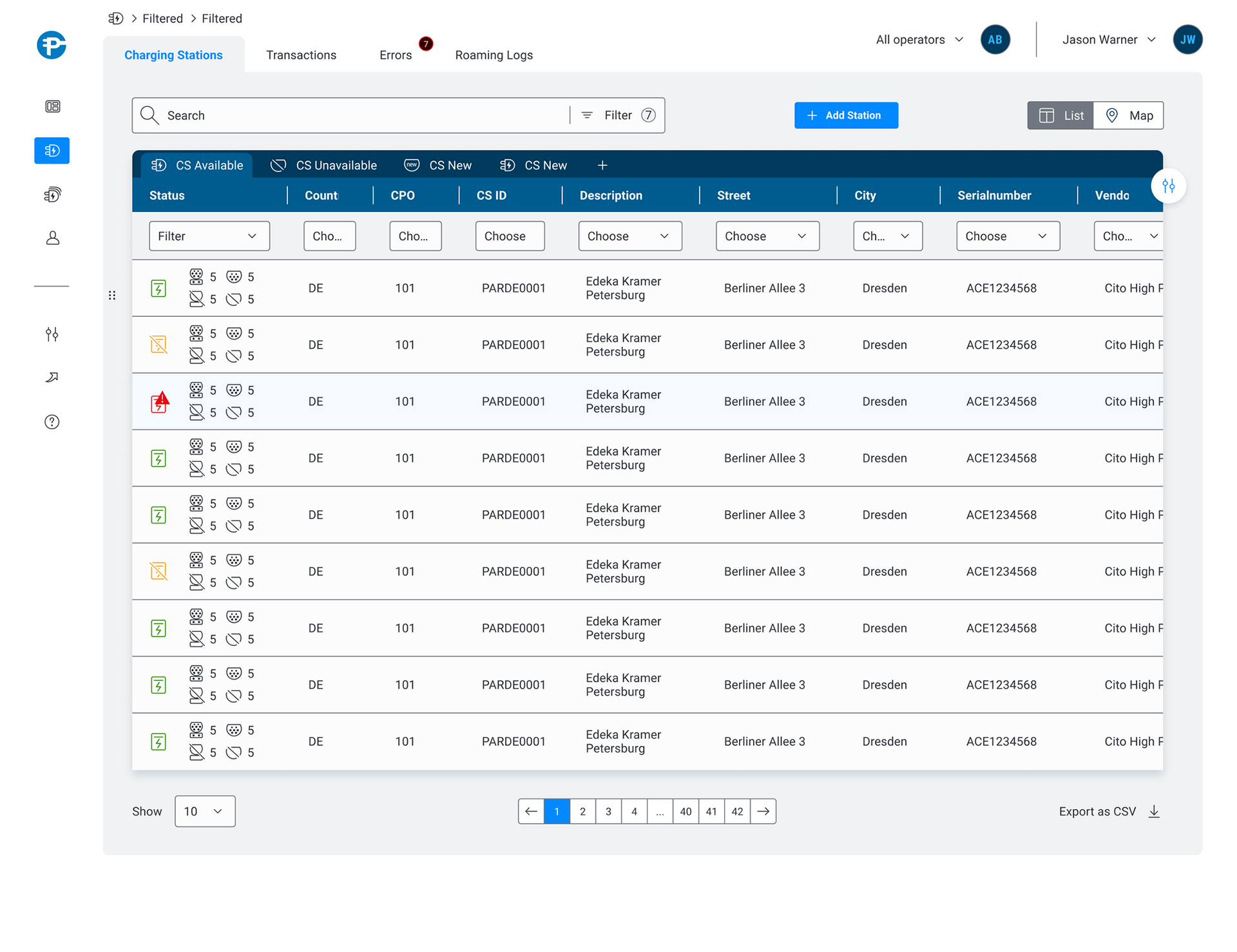
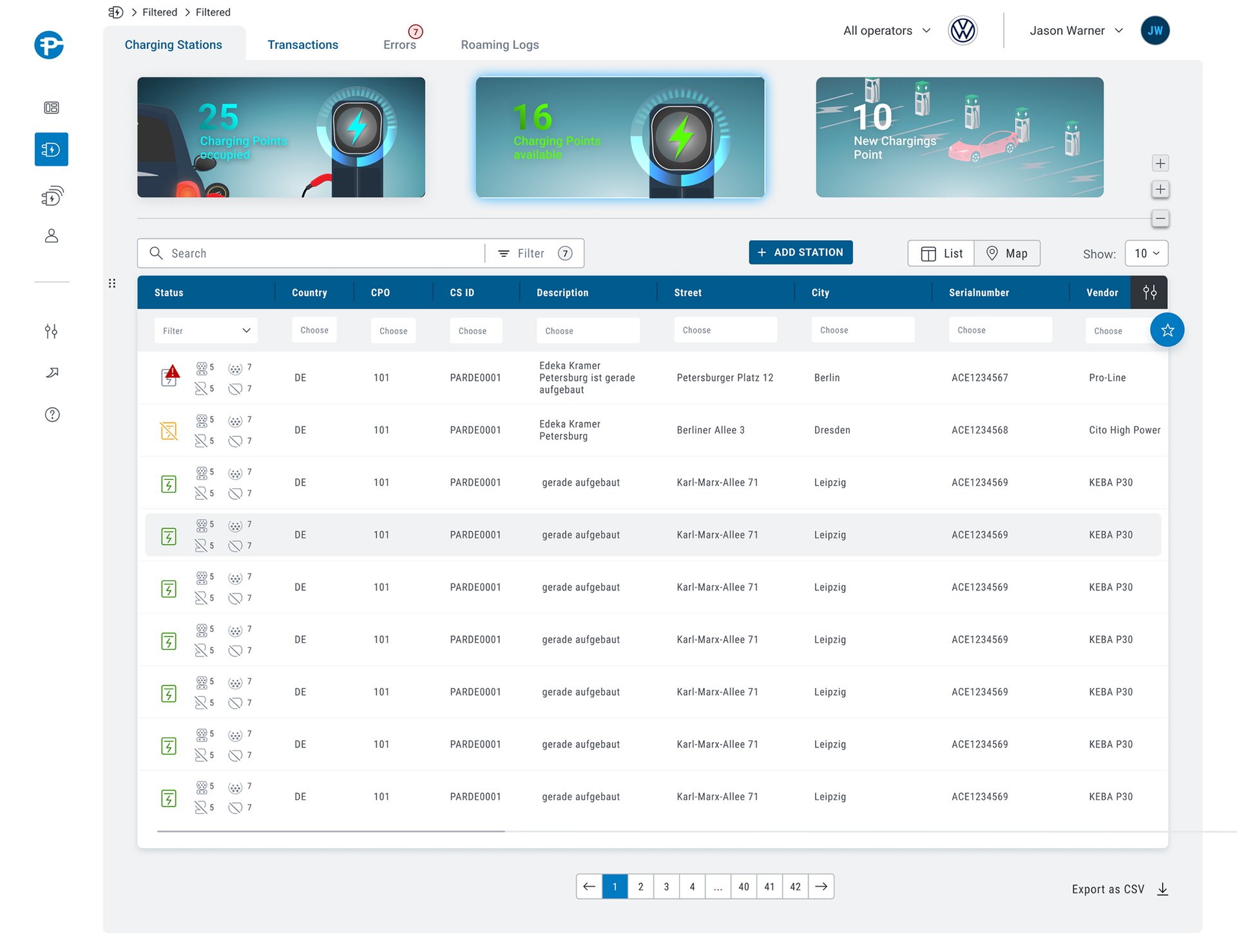
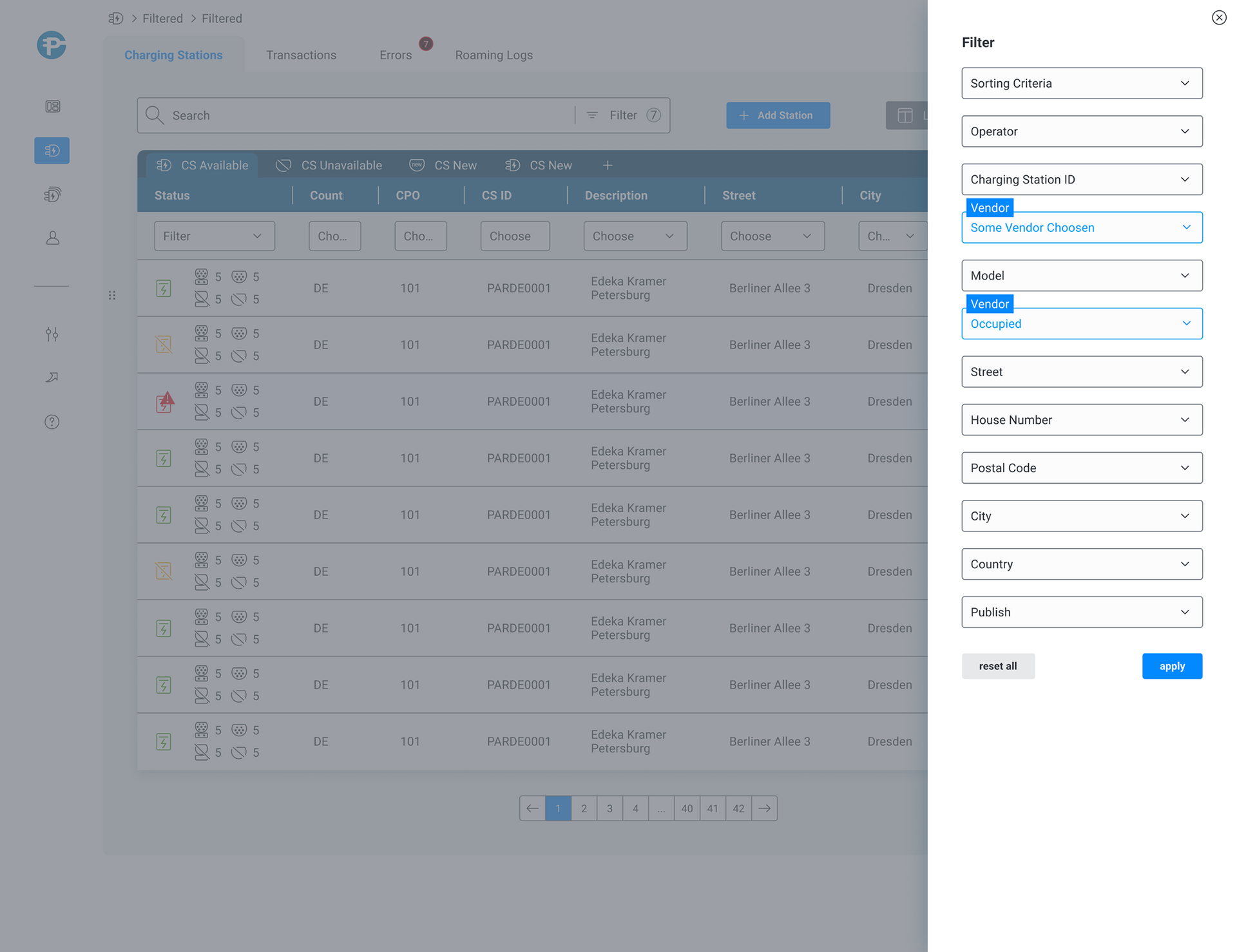
Filter view
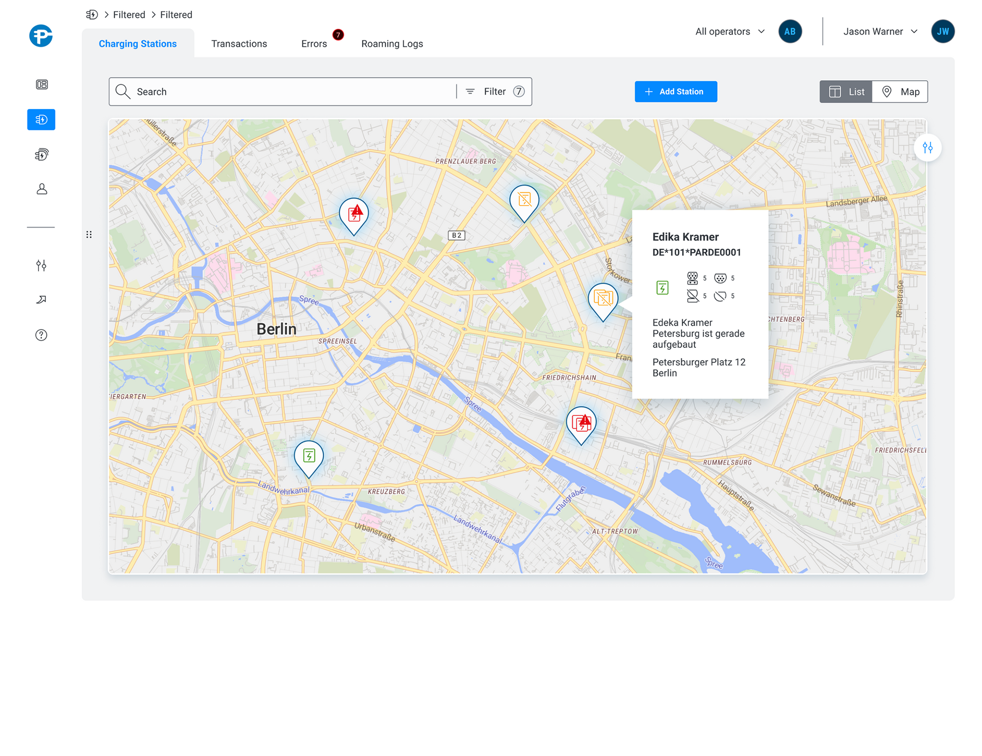
Map view
Whats next
Since the project's launch, we have obtained an increased amount of user feedback, which has enabled us to make continuous optimizations to the UI. One significant area that requires our attention is the development of a design that caters to larger screens. This is particularly pertinent since a majority of operators utilize such screens, with some even using dual screens.
As for smaller platforms, there is currently no use case, but we are conducting an investigation to determine the feasibility of deploying the software on tablets.